
This little guide serves as an introduction to accessibility for iOS developers. Code samples will primarily be provided in SwiftUI.
Summary
- Introduction
- The Golden Rules of Accessibility
- VoiceOver: The Screen Reader Built into iOS for Visually Impaired Users
- Item and Font Enlargement (Dynamic Type)
- Contrast and Colors
- Touch Actions Accessible to All
- Testing Tools
- Conclusion & Going Further
Introduction
Why Does Accessibility Matter?
Digital accessibility isn’t a “nice-to-have”, it’s a necessity. Our apps must be usable by as many people as possible, in all of life’s situations:
- Permanent or temporary disability: visual impairment, motor disorders, hearing loss
- Fatigue: after a long day, our ability to concentrate decreases
- Aging: presbyopia, arthritis, mild cognitive impairment
- Reading difficulties: dyslexia, illiteracy, language barriers
- Device diversity: different screen sizes, varied usage conditions
- And more!
It’s important to consider all of your users from the very beginning of an app’s design process. “People with disabilities won’t use my app” is a false assumption: if your app isn’t accessible it will prove you right, yet wrongly so.
An Evolving Legal Landscape
As of June 29, 2025, the European Accessibility Act (EAA) came into force. This European directive (available here in English) requires companies in the European Union to make their digital services accessible to everyone, including people with disabilities.
It should be noted that the French government is not setting a good example; these services remain extremely difficult to access, even though they are required by law, an example NOT to follow!
On the App Store Side
Apple has also strengthened its commitment with the introduction of accessibility labels on App Store product pages. These labels highlight the accessibility features built into apps:
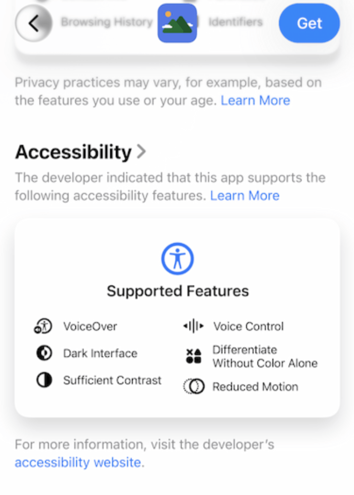
- VoiceOver
- Voice Control
- Larger Text
- Sufficient Contrast
- Reduced Motion
- Subtitles
This allows users to check an app’s accessibility before downloading it and helps developers highlight their accessibility efforts.
Please note: At this time, the App Store does not perform accessibility checks; these labels are purely declarative!
The Golden Rules of Accessibility
Rule #1: Diversify Information Channels
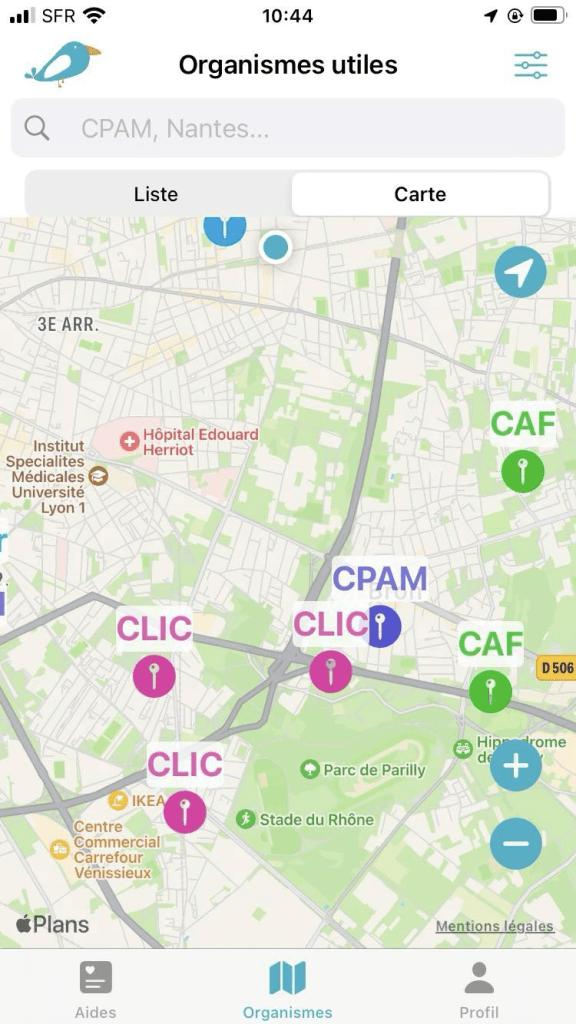
Favor multiple ways of conveying information, without overdoing it.
For example, for a map: offer the information as a list alongside the map.


You can also incorporate haptic feedback (vibrations) when a button action is successful:
let impactMed = UIImpactFeedbackGenerator(style: .medium)
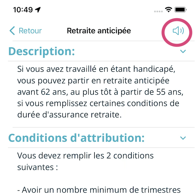
impactMed.impactOccurred()Feel free to include a text-to-speech feature for long texts. Any videos available on your app should always be subtitled.
To help users, pay close attention to your visual cues: consider contrast and avoid relying solely on color to convey information
Rule #2: Simplicity above all
Avoid sensory overload — too many animations:
- Cause loss of focus
- Trigger nausea
- Increase cognitive fatigue
VoiceOver: The built-in screen reader in iOS for visually impaired users
Apple offers a screen reader called VoiceOver for users who are visually impaired or blind. SwiftUI provides simple guidelines and tools for implementing VoiceOver support.
Prioritize the information
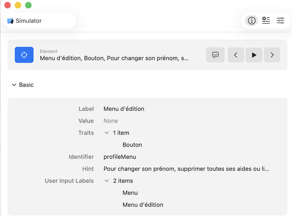
Properly structuring your information—in addition to being a universal UX rule—simplifies the use of the VoiceOver Rotor (a virtual circular menu in VoiceOver, accessible by rotating two fingers like a dial), allowing you to quickly jump between different types of elements on the screen.
This structuring of information can be easily achieved using SwiftUI’s basic components:
Groupto organize items logically- Modifier .
accessibilityElement(children: .combine/.ignore/.contain):.combineto group items,.ignoreto provide its own label,.containby default ListandSectionto organize organize the contentNavigationTitle
Image Management
To ensure proper handling of images in VoiceOver, you have two options:
- Hide decorative images
- Describe the images
Image masking:
Image("decoration")
    .accessibilityHidden(true)
Image description:
Image("logo_book")
    .resizable()
    .scaledToFit()
    .frame(width: 175, height: 175)
    .accessibilityLabel("Bird with glasses and a prosthetic leg, reading a book")
If your users upload their own images, ask them to describe them! Store this alt text in your database alongside the image.

If your images come from an API, you can either mark them as decorative or use the available descriptions, if any.
Buttons
If you use the SwiftUI Button component, VoiceOver will recognize it as such, but there are a few rules to follow:
- The label must be descriptive (this rule applies to all users)
- For buttons that are icons, you must attach an accessibility label to them:
Button {
    showAlertReDO.toggle()
} label: {
    Image(systemName: "arrow.counterclockwise")
        .foregroundColor(.teal)
}
.accessibility(label: Text("Redo the test"))
If you want to add additional information (a hint), you should use the modifier .accessibilityHint().
This is not required; you should add it only if the action is not obvious or has significant consequences, such as the permanent deletion of information.
Button("Delete") {
    deleteItem()
}
.accessibilityHint("Permanently delete the photo")“What if I’ve gotten into the (bad) habit of not using the Button component but instead creating clickable elements via onTapGesture?“
“Fake” buttons are the enemy of accessibility! VoiceOver doesn’t recognize them as buttons! You must therefore add an accessibility “attribute” to let the tool know that this fake button is actually a button, in addition to describing the action it performs.
Image(systemName: "heart")
    .accessibilityHidden(true)
    .accessibility(addTraits: .isButton)
    .accessibility(label: Text("Add this location to your favorites"))
    .onTapGesture {
        // code
    }
Les utilisateurs de Voice Over peuvent également avoir plusieurs actions proposées pour un bouton:
Text("Article")
    .accessibilityAction(.default) {
        // main action
    }
    .accessibilityAction(.activate, "Share") {
        // secondary action
}- The
.defaultaction is the main action, triggered by a double-tap on the element: in this case, the double-tap opens the article - The
.activateaction labeled “Share” creates a secondary action accessible via the VoiceOver “rotor” (a two-finger rotation gesture that lets you cycle through available actions): here, the rotor lets you share the article without even opening it
What about the other components?
For other SwiftUI components (Picker, Link, TabView, etc), use descriptive labels!
Note that you can detect whether VoiceOver is enabled or not :
@Environment(\.accessibilityEnabled) private var accessibilityEnabled

@Environment(\.accessibilityVoiceOverEnabled) private var voiceOverEnabled
Very convenient because the screen reader doesn’t just provide a voice description of elements—it also offers a different way to perform actions!
For example, a double-tap instead of a single tap for an action, swipes that aren’t handled correctly, status notifications (see below), etc.
Status Notifications
Status notifications allow you to verbally announce a status change to the user. VoiceOver pauses what it is currently reading, verbally announces the specified message, and then resumes reading normally.
AccessibilityNotification.Announcement("Article saved")
   .post()
Enlarging items and fonts (Dynamic Type)
Many users increase the font size on their phones for convenience, due to a disability, or because their eyesight is declining with age, don’t forget about them!
Font Enlargement: The Winning Trio
1. Dynamic Type : Use the system font styles or adapt your fonts to match the existing size types (title, title2, body, footnote, etc.)
Text("My very interesting text")
    .font(.title)
2. ScrollView : Make your text blocks scrollable, if not, text will be cut.
3. Line limits: Remove the limits
Text("A very long text...")
    .lineLimit(nil)
Enlargement of other elements
Use @ScaledMetric to adjust spacing and sizes:
@ScaledMetric(relativeTo: .body) var defaultScaledPadding:
: CGFloat = 8
Contrasts and Colors
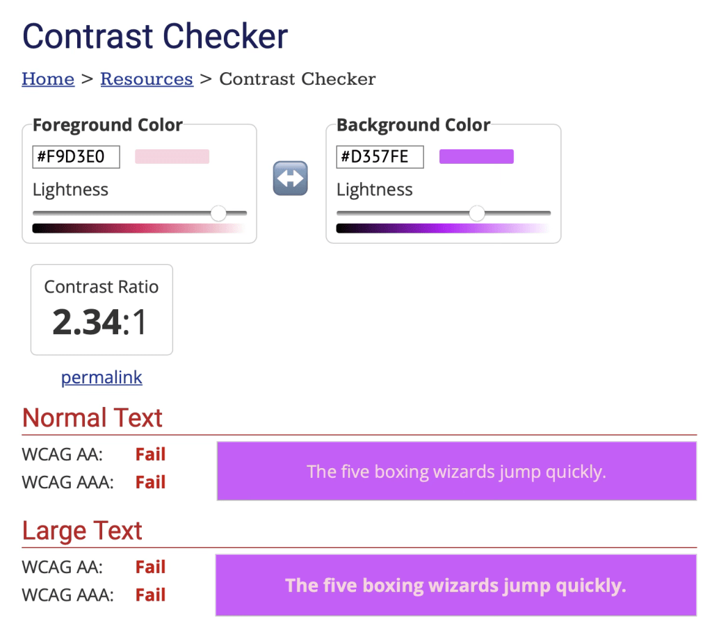
Testing contrasts
Pay attention to contrast (the colors of text against backgrounds and images). Insufficient contrast can make your text difficult to read or strain your users’ eyes.
Use tools like the Contrast Checker to check your text-to-background contrast.
Color differentiation
Never rely solely on color to convey information; always include:
- Different visual patterns
- Icons
- Explanatory text
Touch-based actions accessible to everyone
When complex movements are impossible
Certain disabilities and muscle weaknesses make tactile actions difficult or even impossible to perform. Offer alternatives to complex gestures:
- Pinch to zoom → + and – buttons
- Long presses → dedicated buttons
- Multi-finger gestures → menu options
Switch Control
Switch Control is an Apple accessibility feature that allows you to control your iOS or macOS device using external switches (such as a joystick, gamepad, single-button switch, the Ablenet Blue2 switch, le XBox Adaptative Controller, etc. ) instead of the touchscreen. This is primarily intended for users with severe motor disabilities who cannot use the touchscreen normally.
Your app is scanned automatically: elements are highlighted one by one or in groups; when the correct element is highlighted, the user presses their switch to select it.
Detect if Switch Control is active:
@Environment(\.accessibilityEnabled) var accessibilityEnabled

@Environment(\.accessibilitySwitchControlEnabled) var switchControlEnabled
Next, you can review both the app’s UI and UX when this tool is enabled.
A few tips:
- Group elements to make navigation easier
- Simplify complex interfaces
- Define the order in which elements are scanned (text, buttons, etc.)
- Hide decorative and “unnecessary” elements.
A beautiful app is great, but if it’s not usable, it’s useless! A simple if/else statement, however, allows you to keep your main design for the vast majority of your users.
var body: some View {

    VStack {

        if switchControlEnabled {
            Text("Activated Switch Control view")
            AdaptativeView()
        } else {
            ClassicView()
        }
    }
}
Key principle: With Switch Control, just as with VoiceOver, less is more. Every additional element means more scanning time for the user. The goal is to reduce the number of interactions required.
When touch input isn’t possible: Voice Control
Make sure all your interactive elements can be activated by voice. SwiftUI handles this automatically if your accessibility labels are properly defined.
When a user enables Voice Control, they can switch between different modes using the following phrases :
- Show names
- Show numbers
- Show grid


From a developer’s perspective, we can customize the display names to make the experience as easy as possible (using short, intuitive names).
As with VoiceOver, for our action-performing components (buttons, pickers, toggles, etc.), we add input labels—that is, a list of voice keywords:
.accessibilityInputLabels() that takes an array of (localized) strings as a parameter
         Button {
            isShown = false
        } label: {
            Image(systemName: "xmark"
        }
        .accessibility(label: Text("Close the page"))
        .accessibilityInputLabels(["Close", "Close the page", "Previous", "Return"])
Use (very) short sentences whenever possible, and list keywords in order of importance.
Testing tools
Accessibility Inspector (Xcode)

In: Xcode > Open Developer Tool > Accessibility Inspector
The Accessibility Inspector is a tool within Xcode that allows you to:
- Perform an accessibility audit
- Test the semantics of components
- Navigate the accessibility tree
- Simulate VoiceOver
Testing on physical devices
Be sure to test directly on your various iPhone, iPad, and Mac devices by enabling the different accessibility options in the settings.
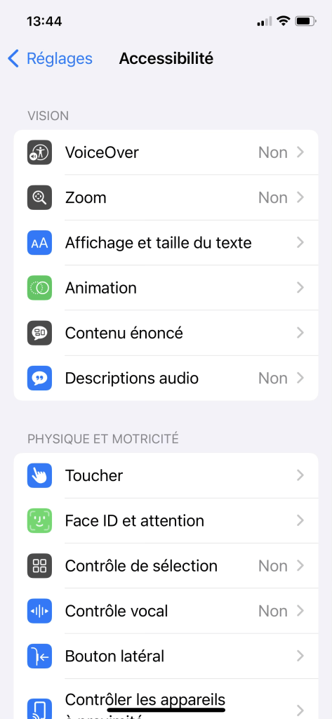
In: Settings > Accessibility
Test directly on the device with:
- High-contrast mode
- VoiceOver enabled
- Voice control enabled
- Different font sizes
You should test all your user flows by enabling various accessibility options. Don’t hesitate to test on different devices as well! (small iPhone, iPad, etc.).
There are many accessibility tools and many components across your various screens to test. To help you be as thorough as possible, Apple has documented numerous test cases, which can be viewed here.
Automated testing
SwiftUI also allows you to write accessibility tests using the XCTest framework, verifying that important elements are correctly recognized by VoiceOver (correct label, element exists and is usable) and that navigation remains accessible. For example, in a login view :
Button("Login") {
    login()
}
.accessibilityLabel("Login")
.accessibilityHint("Validating email and password, then open main view")
.accessibilityIdentifier("loginButton")
You can then write a simple UI test to verify that the button is accessible :
func testLoginButtonAccessibility() {
    let app = XCUIApplication()
    app.launch()
    let loginButton = app.buttons["loginButton"]
XCTAssertTrue(loginButton.exists)
    XCTAssertTrue(loginButton.isHittable)
    XCTAssertEqual(loginButton.label, "Login")
}
Starting with iOS 17, you can also run an automatic accessibility audit that detects missing labels, insufficient tap sizes, or contrast issues—feel free to explore this new feature! More info here.
unc testAccessibilityAudit() throws {
    let app = XCUIApplication()
    app.launch()
    try app.performAccessibilityAudit()
}
User testing
Perhaps most importantly and most relevant: Be sure to include people with disabilities in your user testing. Because of their habits and the ways they use their phones and apps—which can sometimes be very different from ours—their feedback is the most valuable!
Conclusion
Accessibility isn’t a feature to be added at the end of a project; it’s a design philosophy that must be built in from the start. By following these principles and using the tools provided by SwiftUI and iOS, you’ll create truly inclusive apps—and the time spent managing accessibility will be minimal!
The initial effort required for training and design may seem significant, but the benefits are immense: a better UX for everyone, compliance with legal requirements, and the satisfaction of contributing to a more equitable digital world!
Remember : an accessible app is a higher-quality app for everyone! 💪🦾
Further Resources
– Apple Documentation : The essential HIG (Human Interface Guidelines), which include accessibility in their guide (en anglais).
– WWDC : Writing Great Accessibility Labels
– Online communities : mobilea11y and the #a11y hashtag on social media